So, a couple of weeks ago I was looking through the previous year's football tab trying to get an idea of what I shot, hoping for some inspiration for this year's covers. What I saw was a real disappointment in what I had shot last year. Most of the covers I had shot were action shots, they were ok, but I didn't really like the overall product that I had done. I know some of that had to do with time constraints, a lot more last year than I had this year. Others were just not real great in the way of ideas that were given, and some of the stories weren't real conducive to producing a good cover. Basically, it boiled down to me being really disappointed in the work that I had done, and I was determined to improve it this year to a product I was happy with.
Over the past few years, in addition to a front cover of the section, we've split up all of the classifications (Class 1A-5A, six-man and college, seven total) with their own individual covers as well. It's a neat idea in theory, and a helluva lot of work in the short period of time that I get to do it in. Basically, I get about a week-and-a-half (eight total days) to get all of these done, in addition to the first four days of practice being taken up by shooting mug shots.

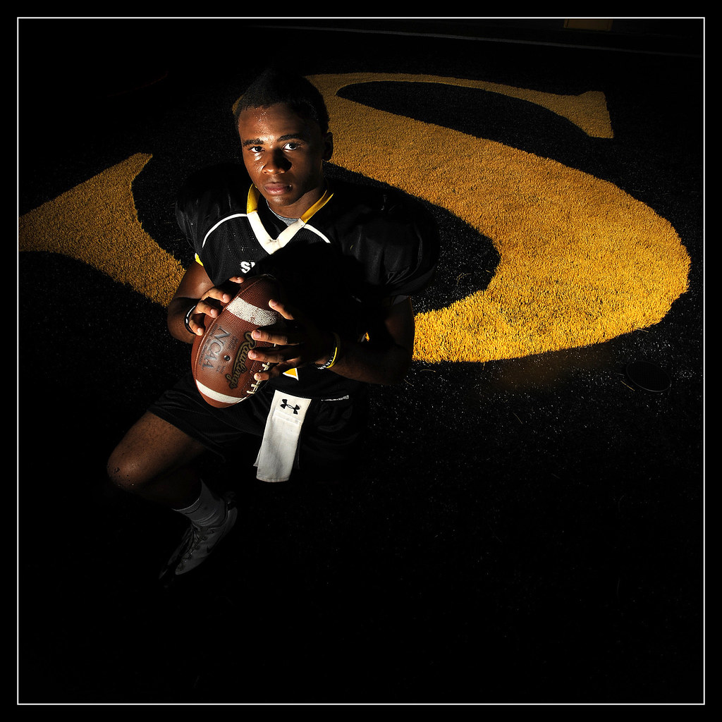
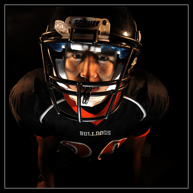
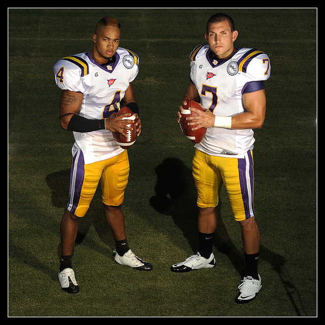
This year, I think it helped that all the cover stories were player features. This allowed me to go out and shoot portraits of the players. Most of them I was able to shoot portraits for, I did use an action shot of one using game file art for one of the covers, just to change it up a little, plus the photo worked really well as a cover shot.
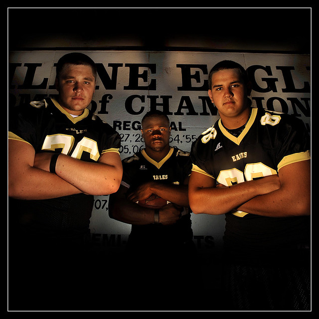
For the overall cover (second from the top), Abilene High was the defending state champs, so they were a natural fit for the cover. I'd originally planned to put them in a dark room and have a black background, but as I was walking into the coaches office I walked by the wall with all the team accomplishments over the year and figured that would make a better background, all that was left after that was putting the players in and setting up the lights. It worked out just right so you could see what was in the background but not be too distracting.

The only other problem I had was trying to avoid making all the photos look the same while maintaining the same style and still leaving some space to put text on the photo for the cover feel while at the same time being stuck having to put it in a 10x10 hole (which was the page dimensions). I think it worked out ok. I was happy with the overall product, of course there were some photos I liked better than others, but that's going to happen any time. But, compared to last year, the sum of the covers were considerably better.


No comments:
Post a Comment